
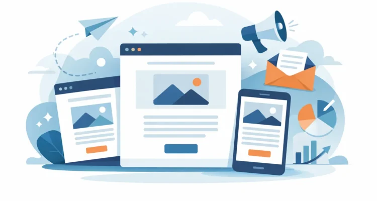
A customer opens your email on a phone between appointments. They should be able to recognize your brand, understand the offer, and take the next step before the screen locks. That is the practical standard for HTML newsletters: not decoration for its own sake, but clear, reliable communication that works in crowded inboxes.
For a small business, nonprofit, sales team, or public-relations office, an HTML email can carry far more useful information than plain text alone. It can present a product image, a price list, a short announcement, a call-to-action button, and contact details in a layout recipients can scan quickly. The challenge is that email is not a web browser. A design that looks excellent in one inbox can break, clip, or become unreadable in another unless it is built with email-specific limits in mind.
What HTML Newsletters Do Better Than Plain Text
Plain-text email still has a place. It is fast to create, personal in tone, and often suitable for a short follow-up, a service notice, or a simple one-to-one message. HTML is the better choice when presentation helps recipients make a decision.
A well-built HTML newsletter gives structure to busy information. A retailer can separate featured products from standard inventory. A nonprofit can show the impact of a recent campaign before asking for support. A consultant can turn a dense monthly update into short sections with clear headings and an easy reply path.
Visual consistency matters as well. Repeated use of your logo, colors, type hierarchy, and button style helps recipients recognize a legitimate message. That recognition can support engagement, but it does not replace good sending practices. A polished email sent to an outdated or unwilling list will still perform poorly and may create deliverability problems.
The trade-off is maintenance. HTML newsletters take more preparation than a plain-text announcement, and they should always have a readable plain-text alternative. The extra work is worthwhile when the layout clarifies the message rather than simply adding visual noise.
Build HTML Newsletters for Email, Not the Web
Many newsletter problems begin when a web page is copied into an email template. Modern website techniques are not consistently supported by desktop email applications, webmail services, and mobile inboxes. Email HTML needs a more conservative approach.
Use a single-column layout as the default, especially for customer communications that will be read on mobile devices. A content width around 600 pixels remains a practical starting point for desktop inboxes, while responsive styling helps the same message adapt to smaller screens. Two-column sections can work for short product comparisons or paired images, but they should stack cleanly on a phone.
Keep the visual hierarchy simple. Start with a recognizable header, then lead with the most relevant message or offer. Use short blocks of text, descriptive subheadings, and one primary action. If a recipient must search through five buttons to find the important one, the newsletter is doing too much at once.
Images should support the message, not carry it alone. Some recipients block images by default, while others may be using a slow connection. Add useful alternative text, use appropriately compressed files, and make sure the key message appears as live text. An image-only promotion may look attractive during design review but communicate almost nothing when images are off.
Avoid relying on JavaScript, embedded forms, video playback, or complicated animation. These features are commonly restricted or handled inconsistently in email clients. A linked image with a clear button is usually more dependable than an ambitious interactive element.
Write for scanning
Email recipients rarely begin by reading every word. They scan the subject line, preview text, headline, image, and first call to action. Put the value early. Instead of opening with a long company update, state what changed, who benefits, and what the recipient can do next.
This does not mean every newsletter needs a hard sales pitch. A monthly customer update, industry notice, or community announcement can be informative first. It still needs a purpose. Ask whether the reader should visit a page, request information, download a document, reply, register, or simply remember an important date.
Use buttons that are easy to understand
A button label should describe the action. “View New Prices,” “Read the Full Update,” and “Reserve a Place” are clearer than “Click Here.” Make the button large enough to tap and leave enough space around it that mobile users do not hit the wrong link.
One primary button is often enough. Secondary text links can serve readers who want more detail, but competing calls to action divide attention. If you have several offers, consider sending separate campaigns to relevant groups rather than forcing every recipient through the same crowded layout.
Personalization Starts With a Clean Contact List
Adding a first name to the greeting is useful only when the underlying data is accurate. A message that begins “Hello ,” or uses the wrong name damages trust faster than a generic greeting. Before preparing a campaign, review the fields you intend to use and set a sensible fallback such as “Hello there” or “Hello customer.”
Personalization can also be more meaningful than a name. Segmenting contacts by location, customer type, purchase history, membership status, or stated interest lets you send information that fits the recipient. A restaurant supplier may send new menu items to food-service customers and packaging updates to retail accounts. A nonprofit may send volunteer opportunities to local supporters while sharing policy updates with a broader list.
List quality affects delivery as much as relevance. Remove duplicates, process unsubscribe requests promptly, and check addresses for obvious errors or inactive accounts. Sending repeatedly to invalid addresses increases bounces and can affect your sender reputation. Consent matters too. Build lists through legitimate customer relationships, subscriptions, event registrations, and clearly communicated opt-ins rather than harvested addresses.
For recurring sends, a practical workflow is to import or update contacts, validate the list, assign groups, and keep suppression records separate from active contacts. This makes it easier to respect opt-outs and prevents the same administrative work from returning every month.
Preview and Test Before You Send
Never treat the editor preview as the final test. It shows the intended layout, not necessarily the result in Gmail, Outlook, Apple Mail, or a mobile inbox. Send test copies to accounts you can check on a phone and a desktop computer. Look at the message with images enabled and disabled.
During review, check the details that create avoidable mistakes: subject line, preview text, sender name, reply-to address, personalization fields, links, image alternatives, and unsubscribe information. Read the email aloud once. Awkward phrasing, missing words, and unclear instructions are easier to catch when you hear them.
Also test the message at normal reading size. Fine print, narrow buttons, pale text, and crowded product grids can look acceptable on a large monitor but fail on a phone. If the newsletter is long, make the first section valuable enough that readers who never scroll still receive the main point.
Send at a Controlled Pace
High-volume email delivery is not simply a matter of pressing Send. Email providers may impose hourly or daily limits, and a sudden burst from a new or lightly used sending account can raise concerns. Sending in batches and respecting server thresholds gives the receiving infrastructure time to process the campaign normally.
The right pace depends on your mail server, your sending history, list size, and the quality of the contacts. A list of several hundred engaged subscribers may be handled differently from a list of tens of thousands. When in doubt, start with a smaller segment, check results, and then continue.
Desktop software such as MaxBulk Mailer can help teams prepare HTML content, personalize messages, schedule delivery, and manage sending thresholds without handing over control of their customer list. The useful feature is not automation by itself. It is being able to send consistently while keeping campaign files, contacts, and delivery settings organized.
Measure Behavior, Then Improve One Thing
Open rates can provide a general signal, but they are not a complete measure of reader interest. Privacy features and image loading behavior can make open data incomplete. Clicks, replies, conversions, unsubscribe patterns, and bounce rates often tell a more actionable story.
If a campaign receives few clicks, inspect the message before assuming the offer failed. Was the main action visible without scrolling? Did the button say what recipients would get? Did the email go to a group that actually needed the information? If unsubscribe rates rise, consider whether the frequency, targeting, or expectations set at signup need adjustment.
Change one major element at a time when testing: the subject line, first headline, offer, button wording, or audience segment. That creates useful evidence. Changing everything at once may produce a better result, but it will not tell you why.
The best HTML newsletter is one your recipients can use without effort. Keep the message honest, the layout readable, the list well maintained, and the sending process controlled. Over time, that discipline makes each campaign easier to produce and more welcome when it arrives.